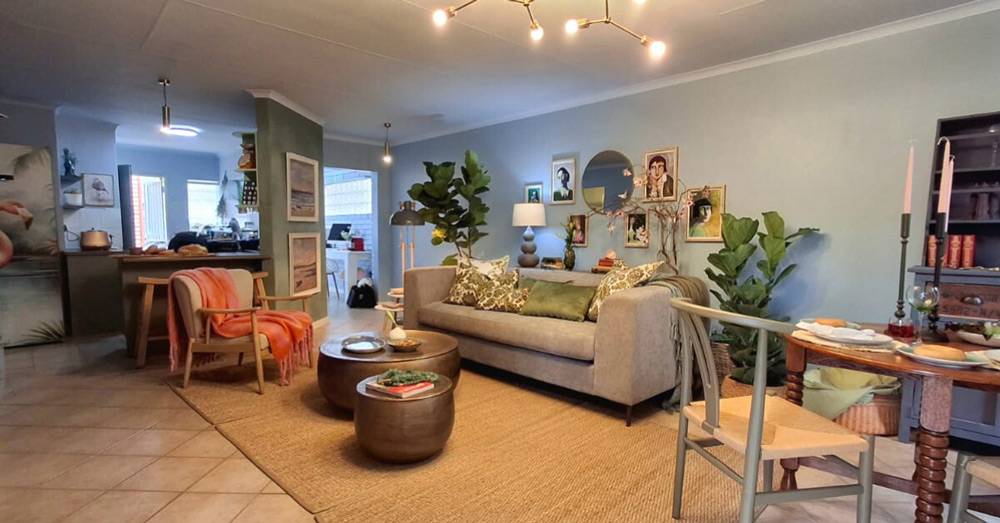
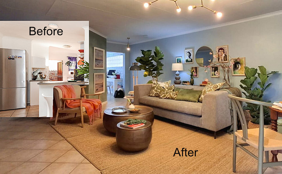
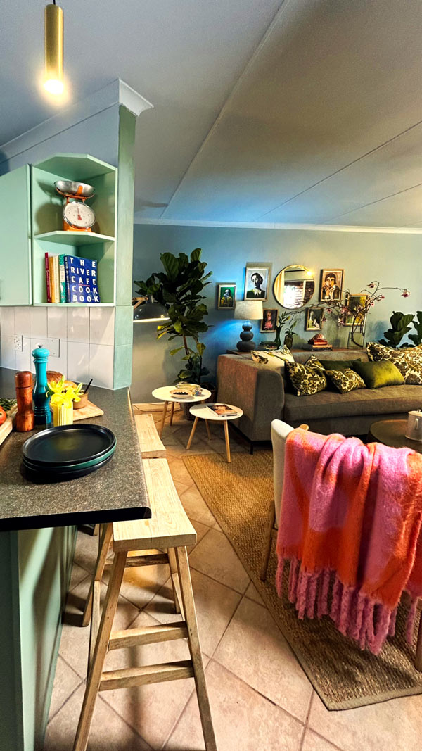
Today, our quest to inject calm and serenity into this home moves across the open plan from the living room into the kitchen.
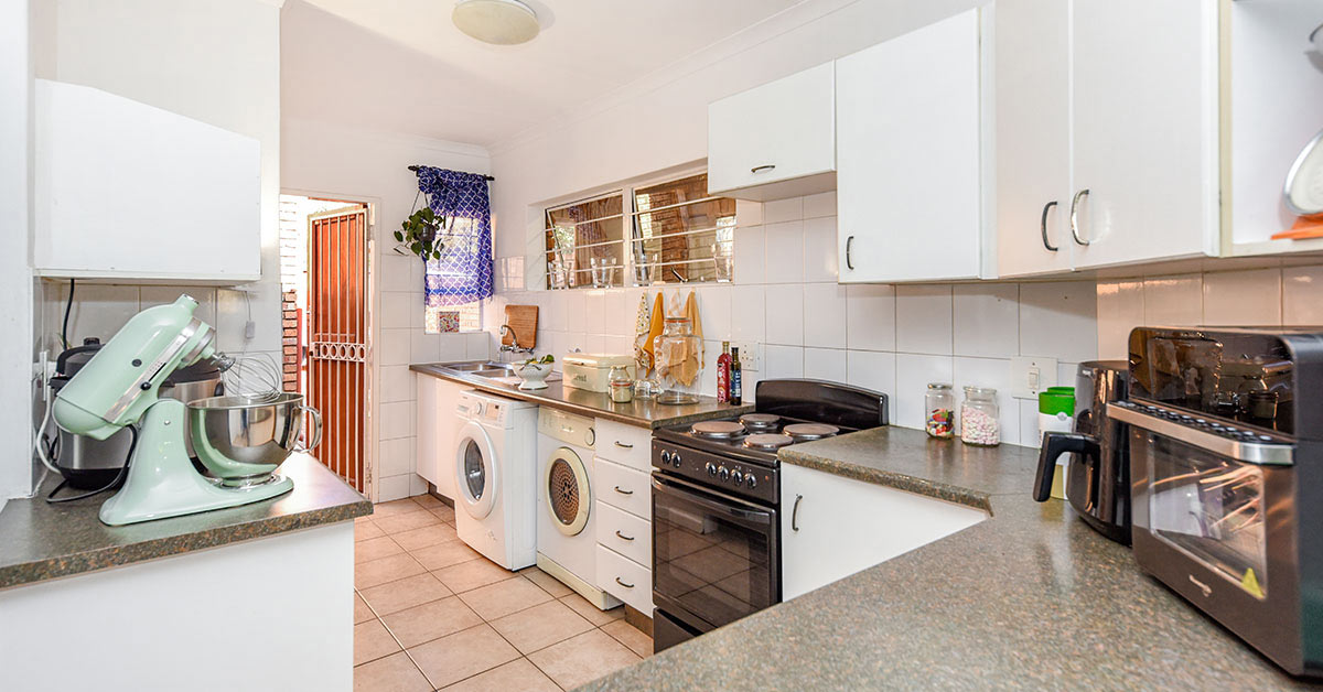
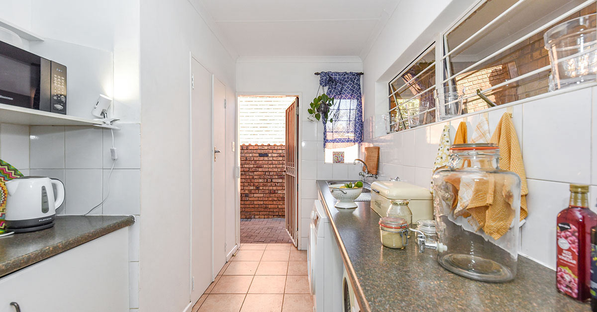
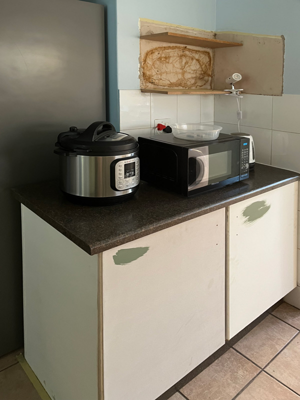
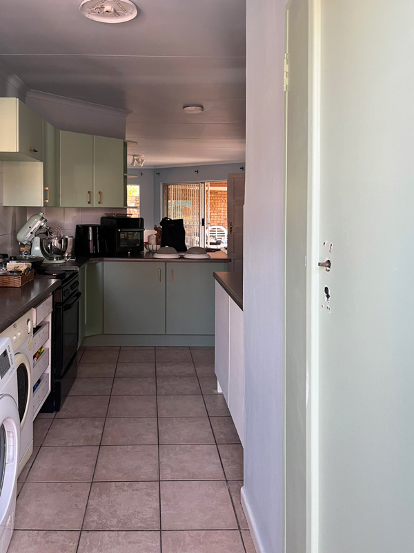
We were faced with outdated fixtures, a different-looking floor and more whiteness, from the walls to the melamine cupboards and wall tiles. Kitchens and bathrooms are notoriously expensive to update or upgrade and this one was no exception.
Don’t despair if you run into the same type of budget challenge I faced here.
A bit of imagination can lead to noticeable even astounding improvements, so give yourself time to play around with a few ideas. My solution was to opt for a mini makeover.
The biggest challenge I faced was deciding how to spend our budget to make the greatest impact on the space itself, while also not looking half-baked next to the beautiful living room. Continuity had to be a priority.
As an accomplished chef who spends a great deal of time in her kitchen, considering the homeowner’s culinary instincts was a fine balancing act.
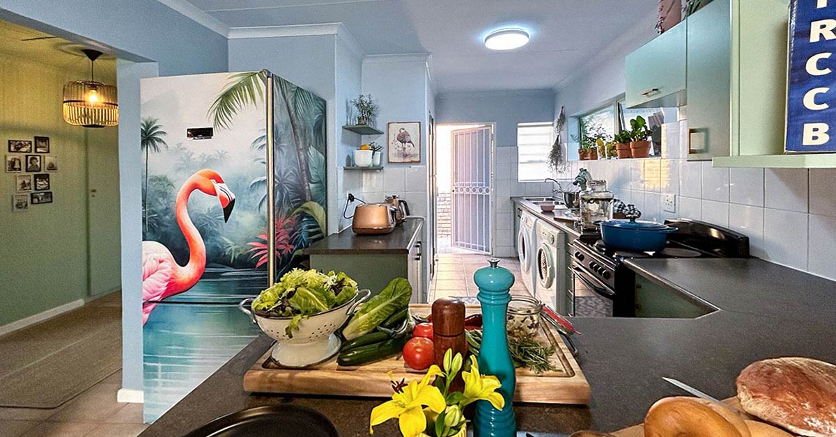
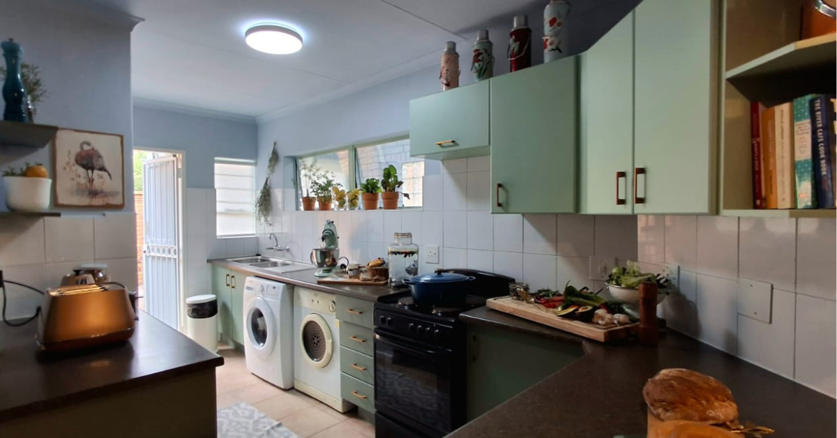
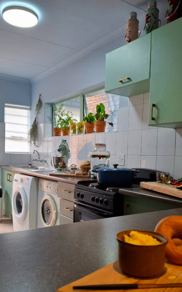
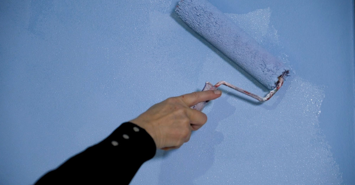
For me, a logical first step was wall colour continuity because, being at eye level, it is most noticeable. I decided to repeat the living area’s cornflower blue hues on the kitchen walls and ceiling, again contrasted with green.
TIP: Doors take up a large portion within the vertical plane of a wall, so it may be worth matching them to the wall colour. We painted the existing back door of the kitchen in the same blue hue as the walls.
Fired Earth’s Ultimate Coat is a good foundation paint to use for its durable, luxurious medium sheen finish. It can stand up to kitchen conditions that require occasional cleaning. The ceiling was mixed two shades lighter than the cornflower wall colour.
The beauty of going beyond simply selecting paint colours by mixing your own specific custom colours, is that you can create something unique and meaningful. As a colour therapeutics practitioner, I understand how deeply colour can influence mood and energy.
I found it gratifying to be able to develop these hand-mixed and eye-matched custom paint colours specifically for this client, to create a calm and relaxed mood around her. It resulted in an atmosphere that not only looked beautiful, but also supported her sense of well-being by soothing her nervous system.
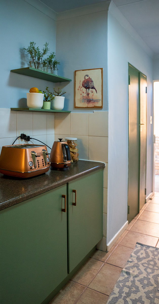
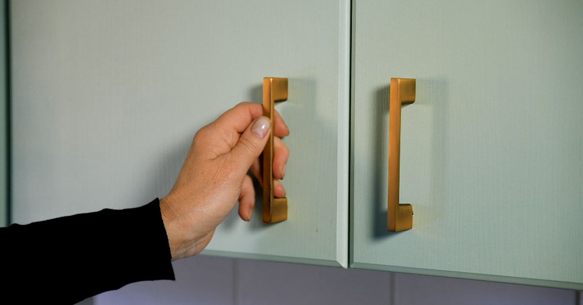
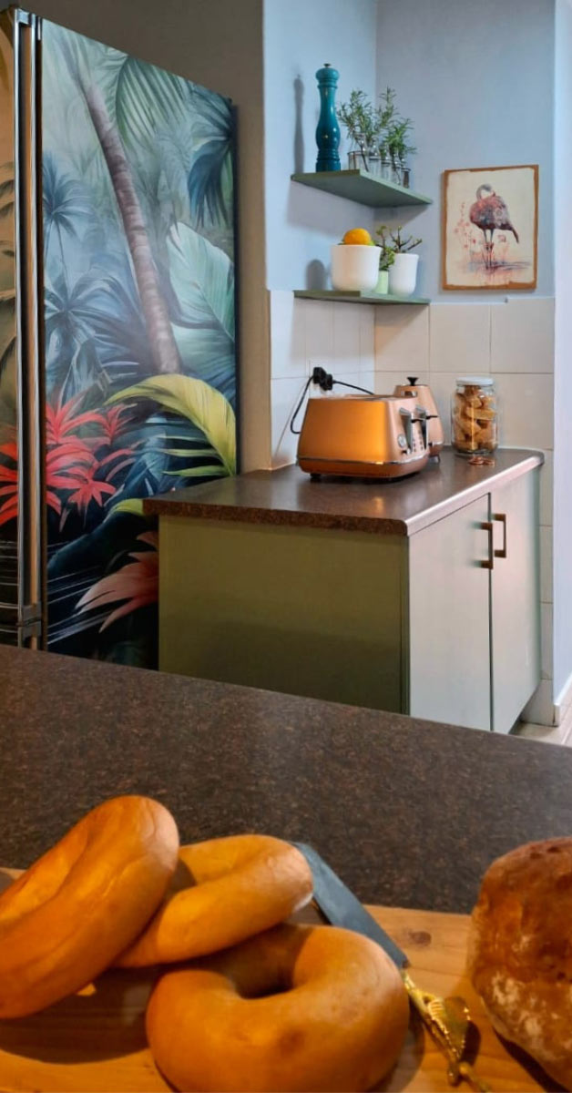
The outdated melamine cupboard doors had to stay, so they were treated with two different shades of green for colour cohesion with the living room. A pastel pistachio green brought a refreshing energy to the kitchen, whilst a darker olive green grounded the tiny space. I used Fired Earth Colour Burst stainers named “Fab” and “Rested” for these two colours.
TIP: Always prepare the paint surfaces properly for the best result and apply more than one top coat for a professional look.
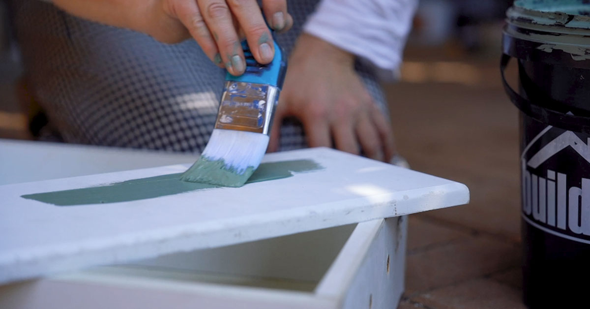
To prepare the melamine surfaces for painting, I cleaned them with a sugar soap dilution, rinsed with clean water and allowed the surface to dry completely. Then, I applied a single coat of Fired Earth Multi Grip Primer for a suitable foundation.
TIP: Always stir the primer well before applying it with your brush and roller. When you’re done, wash your tools with water. Allow the primer time to dry thoroughly before you apply the topcoat.
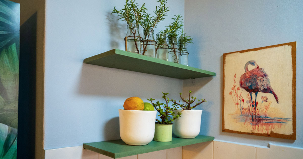
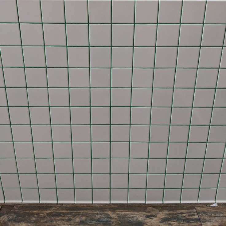
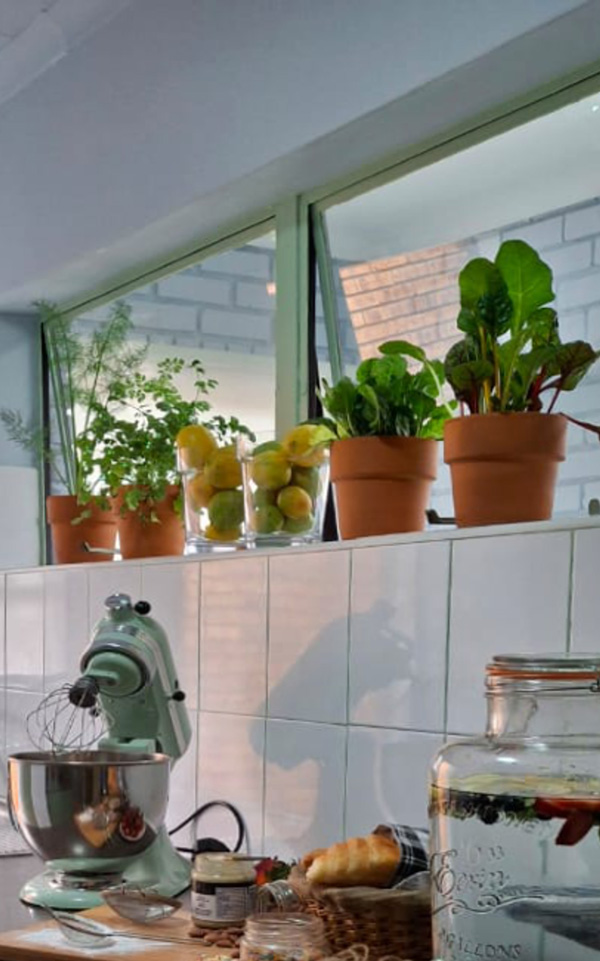
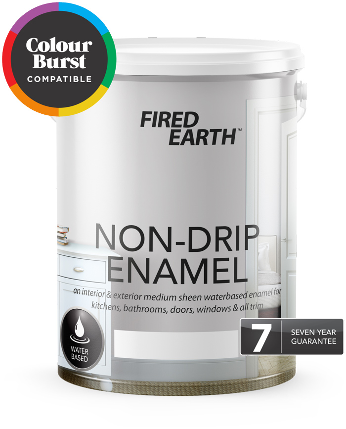
I applied two coats of Non-Drip Enamel, mixed with the selected Fired Earth Colour Burst stainers. We extended the greens to a few other details in the kitchen, like window frames, a few shelves and the wall tile grouting.
I needed a soft and intimate pool of light for when the central kitchen light could be dimmed or turned off. The golden Single Pendant Light is perfect in this spot and fits in well with the golden theme established by the other two light fittings in these two rooms.
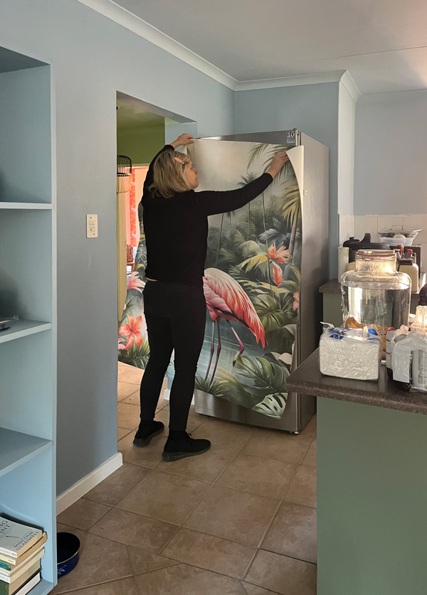
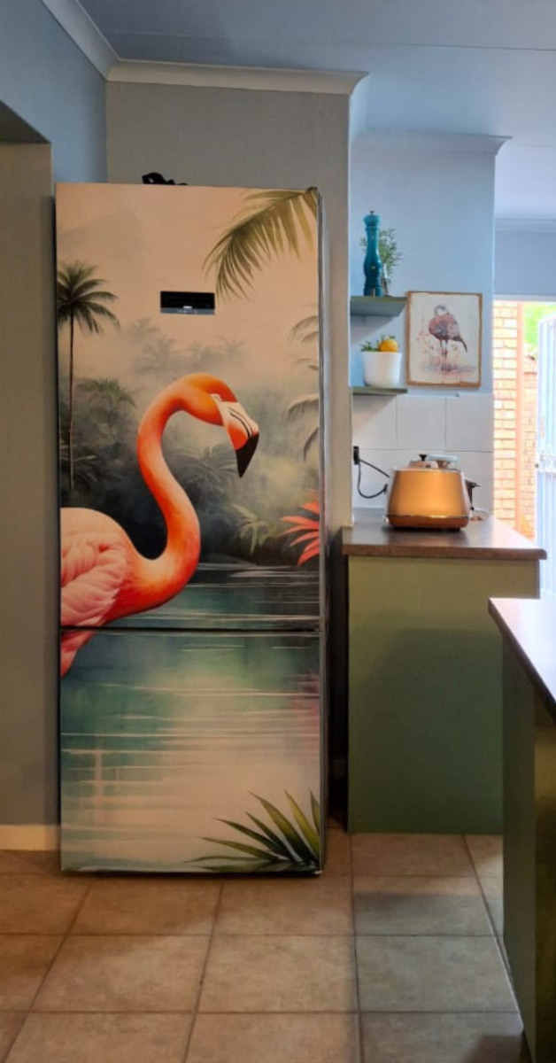
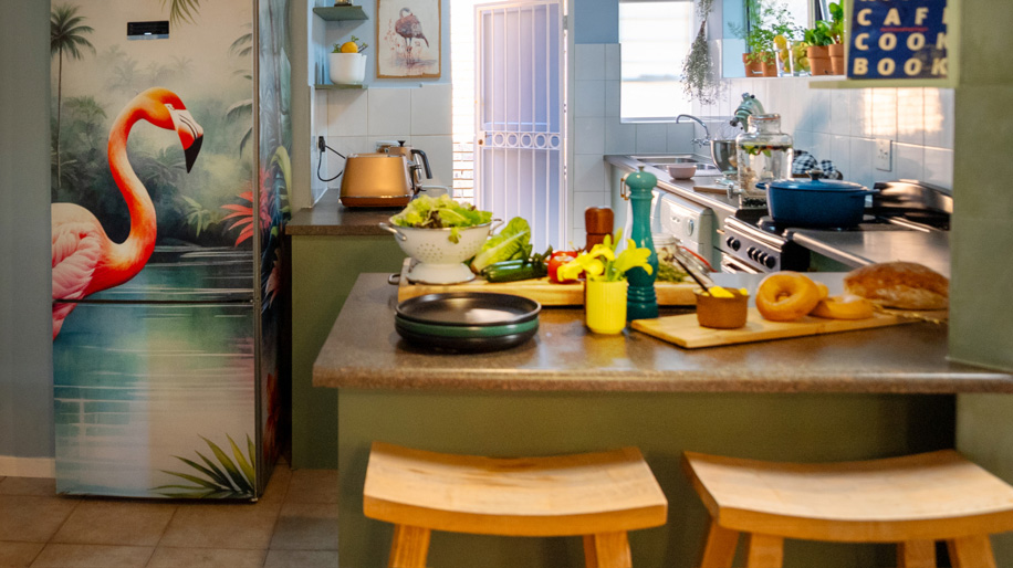
I have to say, the pièce de résistance of the upgrade is the vinyl wrap we applied to the fridge. Who says refrigerators need to be boring? This one has been elevated from a drab necessity to a fabulous focal point. You can have your own unique design applied to your fridge by contacting Sageburger@gmail.com.
Before this project, I had never even considered vinyl wrapping a fridge and now this is one of my favourite touches in this home. The owner suggested the idea and her adventurous spirit really shone through! I am so grateful that we had the kind of relationship where we could brainstorm together and bring some unique ideas to life.
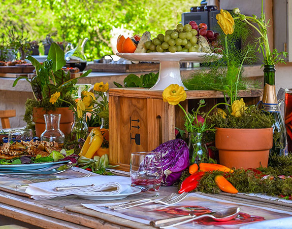
The other window lent itself to another special feature: since it receives plenty of sunlight, I used the windowsill as a shelf to create a mini potted herb garden. Thanks to our ‘resident chef’, those herbs became a regular feature in the delicious vegetarian lunches she prepared for us during the two months we worked on the project.
This is an example of how something that seems simple and economical can turn out to be a mammoth undertaking that takes far more time and effort than anticipated. I guess it depends on how badly you want the change and how much you are prepared to do yourself, to make it happen. Personally, I think the result was well worth the trouble.
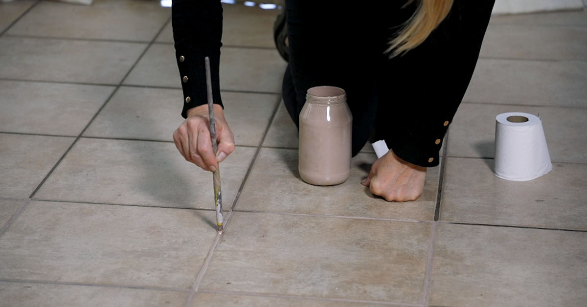
Ideally one would re-grout the lines for the sake of longevity. However, to save time and accommodate the owner, who was not able to move out of the house during the makeover, I decided to paint the grout the lines instead.
As with the wall tiles, this grouting also had to be clean and dry before I could apply the colour. Brushing them clean and waiting for them to dry out took time and patience, but this was a necessary step for success.
TIP: It is important to wipe off excess paint immediately, while it is still wet and easy to remove. The paint takes about two hours to dry. I’d say, keep out of the space for half a day to ensure success.
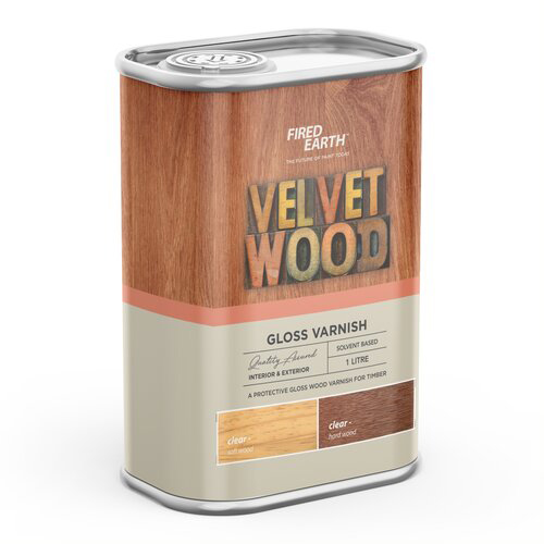
We undertook another bargain hunt for the chairs. By now we already knew just about every bric-à-brac shop in a 20 km radius! It paid off and we returned with two stylish oak counter stools – good bones which needed just a touch of TLC. We sanded them down and varnished them in Fired Earth Velvet Wood varnish.
TIP: Use coarse grit sandpaper number 80 to remove any old varnish. Finish with a finer grit sandpaper, number 240, to make the wood satin smooth to the touch. Be sure to wipe the dusty surface thoroughly clean with dry cloth. I prefer a matt finish and I always apply two to three coats for extra durability.
TIP: Renewing this average sized home, with three bedrooms, two bathrooms, open plan living room and kitchen, took us two months to complete. The many varied tasks required for such a project can make it an overwhelming DIY project if you are doing this for the first time. A good alternative is to hire one or more professional teams, like a paint contractor. If you do, make sure they have good references, ask to see one of their recently completed jobs and try to meet a former client for feedback. It is important to make sure that the contractors bring their own ladders, splash sheets to cover flooring and furniture, as well as a well-equipped toolbox with screwdriver, hammer and other necessary tools needed to remove nails, clean out cracks and apply filler.
Have you attempted a kitchen makeover on a tight budget? Have you perhaps found different solutions to similar challenges? As always, we would love to hear about your project and to help with any questions and challenges, so drop us a line in the comments.
Meanwhile, here is our Builders shopping list for today’s project:
- Fired Earth Multi Grip Primer
- Fired Earth Ultimate Coat
- Fired Earth Non-Drip Enamel
- Fired Earth Colour Burst “Awesome” stainer (blue)
- Fired Earth Colour Burst “Fab” and “Rested” stainers (greens)
- Sandpaper number 80 and 240
- Fired Earth Velvet Wood
- Sugar soap
- Masking tape
- Splash sheets, paint trays, paint brushes, paint rollers and sponge rollers
- Modern kitchen light LED fixture
- Single Pendant Light
- Rose gold cupboard and drawer hardware
- Brass door handle
- Fired Earth Colour Burst stainers: “Awesome” blue and “Fab” green
- Fired Earth Ultimate Coat “White”
- Fired Earth Walls & Ceilings Acrylic “White”
- Bright Star Lighting Retro Chandelier
- Cool White LED light bulbs
- Dimmer switch
- Velvet scatter cushions
- Sisal rug
- Fiddle leaf fig plants, Ficus Lyrata (garden section)
- Splash sheets, paint trays, paint brushes, paint rollers and sponge rollers
