Spring has sprung, offering a refreshing abundance of blossoms and sweet aromas. This year, it also marks a much needed fresh start in life for the owner of this featured home.
From the outset, it was clear to me that this home makeover was about more than simply renewing some rooms. The brief asked me to “transform a once-cozy but now outdated home, in need of TLC, into a vibrant and comforting sanctuary”. I felt sure it was more about helping the owner to heal and to reclaim her identity as she faced a new chapter in her life.
Strict budget limitations made the project a stimulating challenge. We had to think out of the box and consider adapting and recycling existing items and maximising return on investment if we bought anything.
Our transformative journey starts today, in this living room. Every week I will reveal another reimagined space in this 70’s style home and share decorating tips and secrets along the way to help you reimagine and achieve your own makeover successfully.
Our first priority had been for her to decide what to keep, what to dispose or what to send off to family. This was easier said than done: her home and garage were filled to the brim with decades of family possessions.
There were things no one had yet had the nerve to let go of, like outdated clothing, furniture, appliances and sentimental keepsakes.
Her challenge was not unique to her. Many of us have been surprised to discover how much we can accumulate over time, or how much we left behind when we fled the nest. At some point, someone has to deal with the “stuff”. In this family, she was the one sifting bravely through all the tangible memories and deciding their fate.
As she touched each precious object, I could see her emotions surface while she processed the memories they held. It was clearly a powerful transformative experience for her and it showed me how handling and honouring the past can be a very meaningful way to let go.
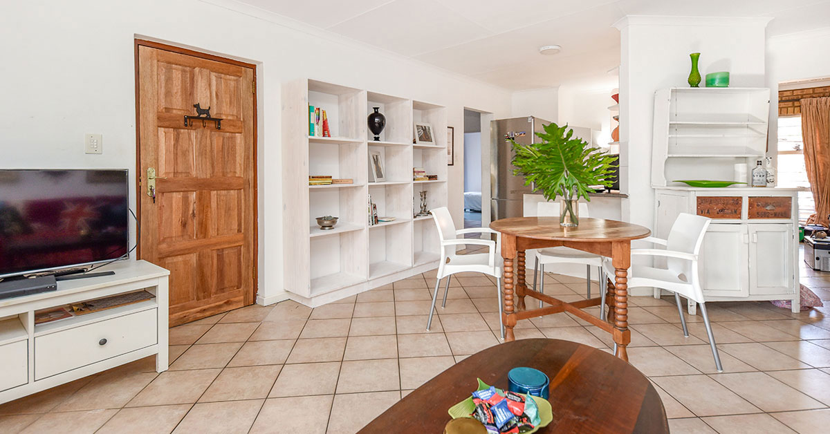
The second challenge on my list was the overwhelming presence of white.
While white is often seen as a timeless, neutral blank canvas, its effect on us is not harmless or neutral at all. My background in colour therapeutics has taught me that stark white spaces can subtly induce stress. By unconsciously affecting our minds, they create an atmosphere that feels more tense than tranquil.
The effect is especially obvious after colour has been applied over white walls. People who don’t have the courage to experiment with colour deprive themselves of this beneficial change.
A quick internet search will deliver loads of ideas on the subject. For a start, look at Color therapy: the room colors therapists swear will boost your mood – and those you’ll find draining and Color Therapy Types, Techniques, and Benefits
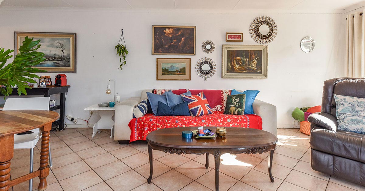
That “neutral canvas” in this ‘Before’ image would bring neither relief nor relaxation to this homeowner, given her high-pressure, deadline driven job, so I decided to use colours that induce a sense of calm and serenity.
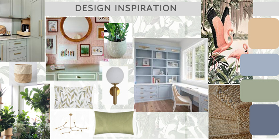
Green accents add gravitas to the room. This is also a healing colour that restores our mind and body.
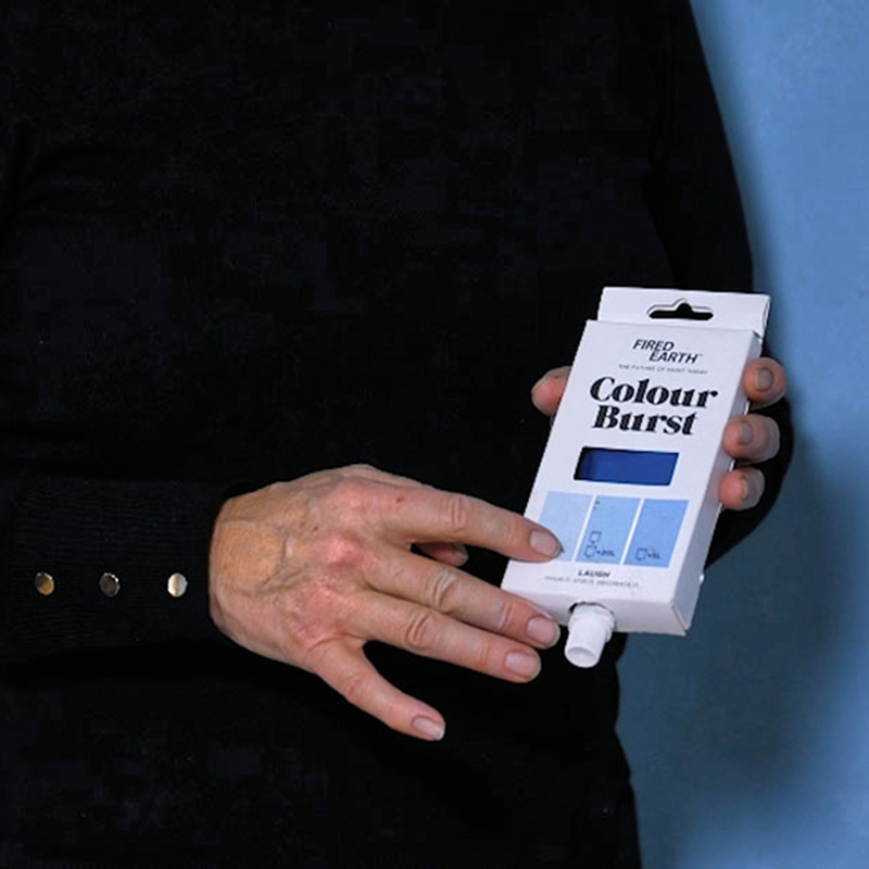
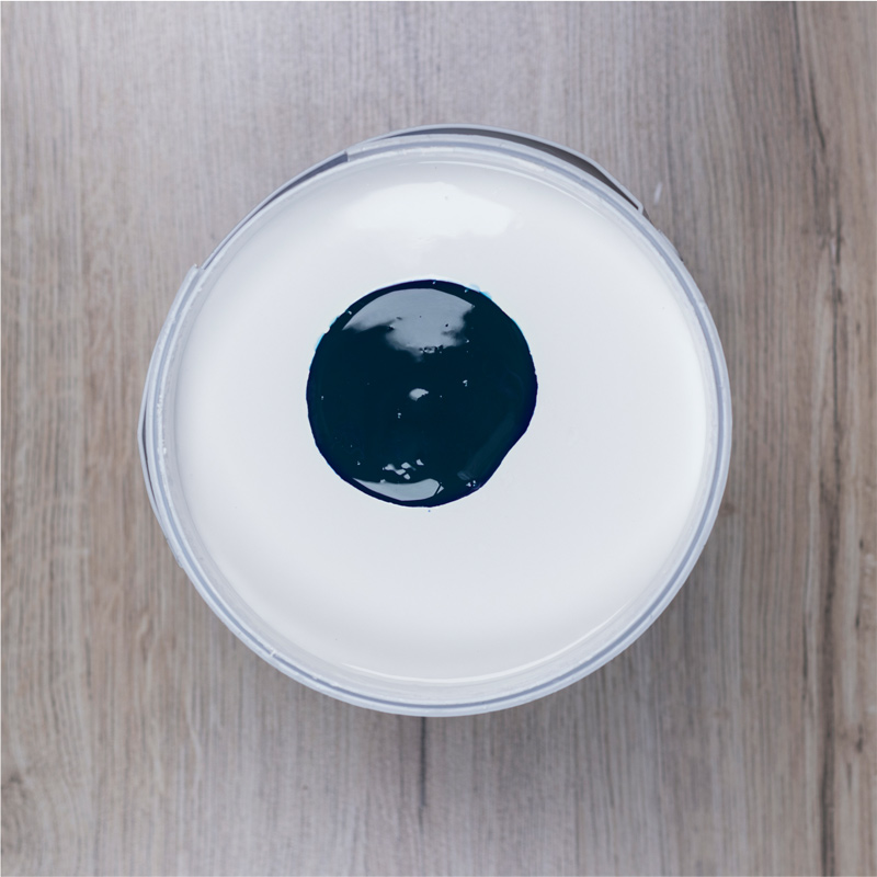
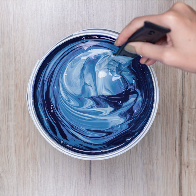
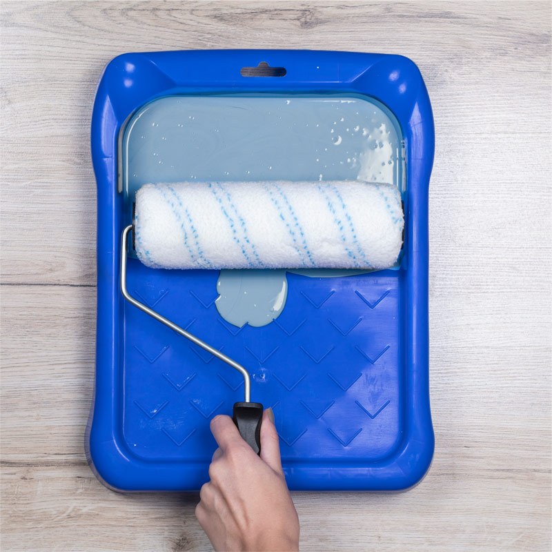
TIP: The fun part was creating my own unique colours. To create the cornflower blue wall colour, I simply stirred two pouches of Fired Earth Colour Burst stainer named “Awesome” into 15 litres of Fired Earth Ultimate Coat white paint. For the ceiling, start by mixing just a little colour, say a third of a pouch of “Awesome”, into the white paint. You can always add more as needed. Check out all the Fired Earth Colour Burst colours you can choose from at fired-earth.co.za. Please note that Colour Burst cannot be used on its own. It is just a pigment so has to be added to a base paint or it will never dry.
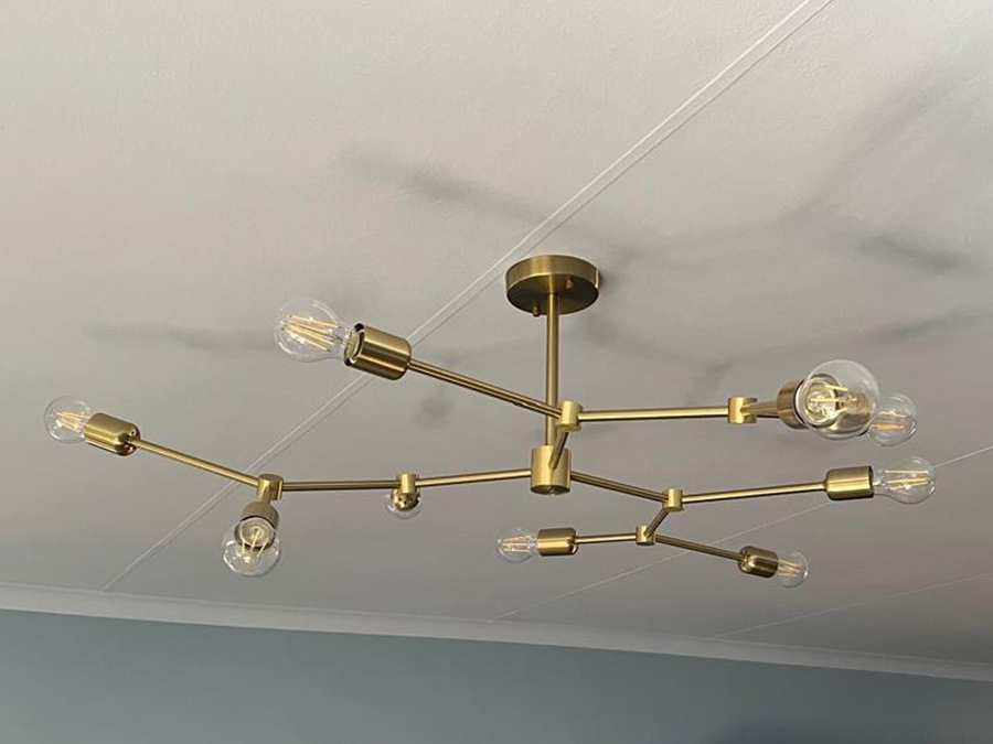
At first glance I hesitated, worrying that the low ceiling might cause the chandelier to hang too low, which is always a big problem for all of us tall people. I really wanted this one for the lounge, to bring in balance and sophistication, so I felt immense relief after the helpful staff in the lighting department had allayed my fears by patiently answering all my questions and concerns. It turned out that the chandelier’s adjustable design would allow the electrician to install it at the perfect height, seamlessly.
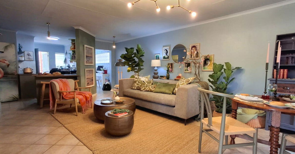
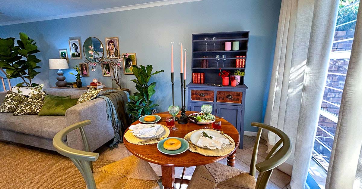
I used Cool White LED light bulbs in the open-plan space to mimic daylight in this naturally dark room. Paired with the soft pastel cornflower blue walls, the lighting enhanced the vibrancy of the paint colour.
Since this space serves multiple functions – office, dining, entertainment – using cool light was intentional to keep the owner feeling focused and energised during her working hours. To create a more inviting atmosphere for evening entertaining, I simply installed a dimmer.
TIP: Consider your lighting options before you start painting. Remember to finish painting before you install the light fittings.
Decorating the room proved another fun project, happily achieved well within our budget. In much of the home, existing curtains could be refreshed, some of the furniture could receive a face-lift and successful bargain hunting helped us to achieve the desired atmosphere.
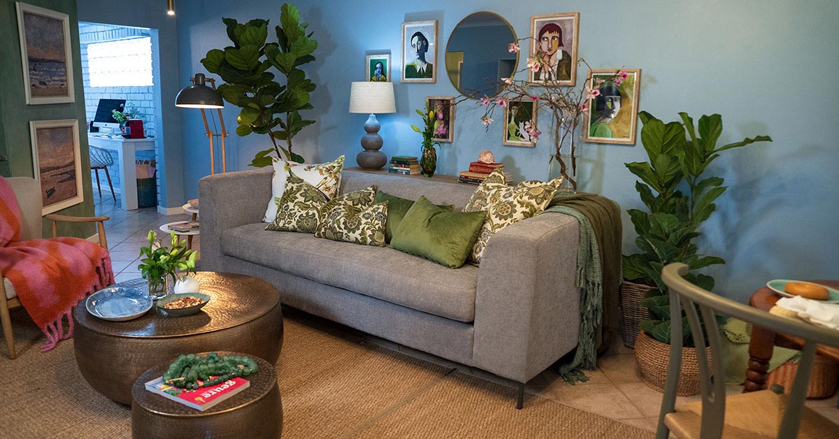
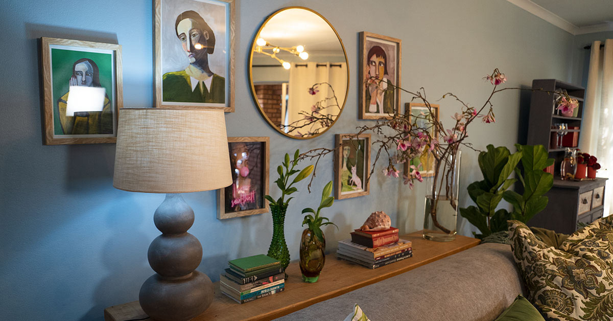
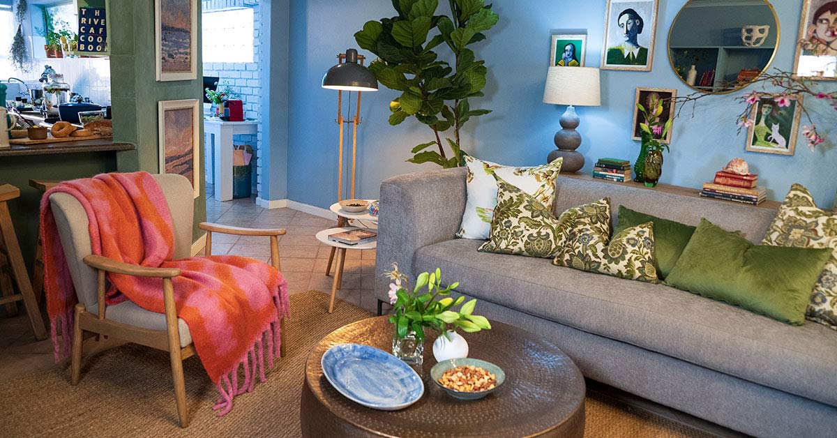
I always like to add a table behind the sofa to introduce depth and different visual heights. When the space or shape of a room prohibits this, as it does here, everything seems to line up at one horizontal level, which makes it feel flat and uninteresting.
TIP: My solution for this room was to use a narrow server, against the wall behind the sofa, which serves exactly the same purpose with great effect.
We used an interesting lamp base and shade with vintage glass vases, a few treasured books and a beautiful shell.
For an informal natural touch, I cut two sprigs of spring blooms from the garden, which brought colour and fragrance into the room.
A picture gallery pulls this room together beautifully. We were faced with a large, prominent wall that needed to be filled. Thankfully, we discovered Nifty Posters online. They are a proudly South African business who print and frame and, best of all, courier to anywhere in South Africa.
We browsed their huge selection of art prints and posters and were happy to learn that inspiring artwork need not cost an arm and a leg. They even offer curated collections of pre-designed gallery walls to take the guesswork out of the equation. You can contact them at niftyposters.co.za.
They also stock this textured sisal rug, which we used to make the tiled floor feel warmer. Lush green fiddle leaf fig plants, Ficus Lyrata, placed close to the wall on either side of the sofa, add a lovely living element as well as more perspective, by casting soft round shadows onto the wall. They are available in the garden section of your local Builders Warehouse.
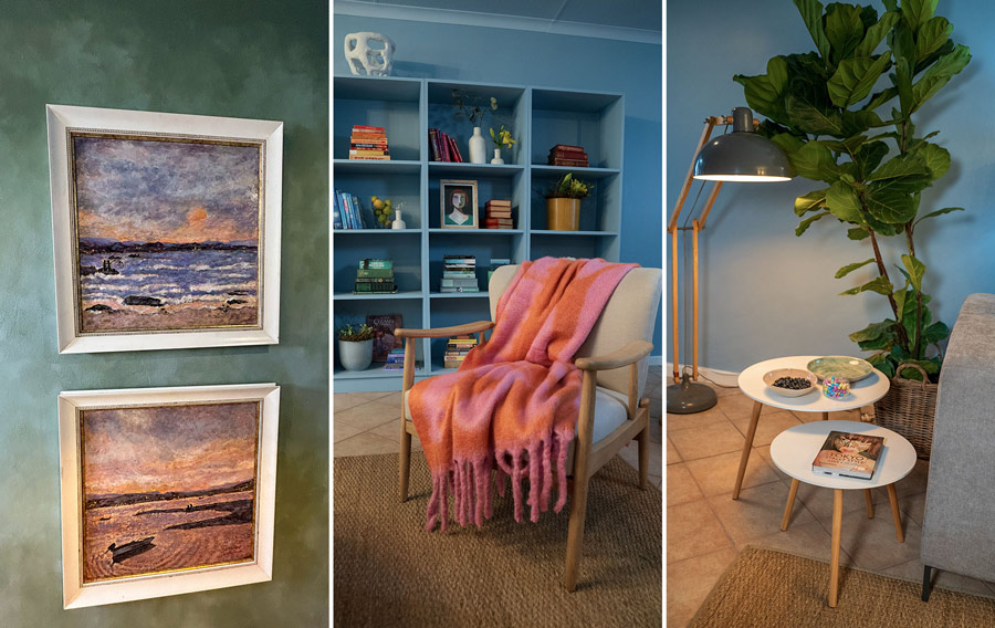
To make this living room feel extra cosy, I draped this comfy, brightly coloured throw over the armchair. With its cheerful colour and tactile touch, this is a guaranteed spark of joy!
On an adjacent green wall, I applied a hand painted colour wash effect. This creates movement and texture and is a wonderful backdrop to show off our client’s original sea-scape artworks. Having travelled extensively, she has a deep appreciation for art, which is reflected in her eclectic tastes.
There are so many different ways you could introduce sparks of joy into your own space. Small vases, picture frames and faux plants are all décor items we used to fill some pigeonholes.
You could put some of your books on display. Or, if you’re Gen Z or someone who prefers using a device, borrow some books from your parents’ house. Alternatively, you could buy a coffee table book each time you travel and, in a couple of years, you will have a nice collection to recall those memories.
Next week we address the kitchen, which presented many challenges for me from which you can learn from to avoid disappointment or even a disaster.
TIP: If you are keen to attempt a home makeover yourself, I suggest you deal with one space at a time, in one month at a time. Deciding and sourcing what you need and planning and finishing all the tasks in one room, could take more time than you expect. It can also be overwhelming to live in the endless grit, grime and dust that comes from tackling several rooms all at once.
Meanwhile, here is a shopping list of Builders items we used in today’s project:
- Fired Earth Colour Burst stainers: “Awesome” blue and “Fab” green
- Fired Earth Ultimate Coat “White”
- Fired Earth Walls & Ceilings Acrylic “White”
- Bright Star Lighting Retro Chandelier
- Cool White LED light bulbs
- Dimmer switch
- Velvet scatter cushions
- Sisal rug
- Fiddle leaf fig plants, Ficus Lyrata (garden section)
- Splash sheets, paint trays, paint brushes, paint rollers and sponge rollers

