
We’ve all heard that colour dictates. TV shows, designers, decorators and magazines continue to tell us what we can and cannot do when it comes to colour.
We all know for instance, that white makes rooms look larger and brighter, that dark colours make them look smaller and that a dark ceiling will make a room feel more confined too. But rules are a guideline only and rules are there to be broken – within reason. A rule is only there as a guideline to support what you already want to do. It’s up to you to follow it, dismiss it or tweak it. But whatever you do, trust your instincts.
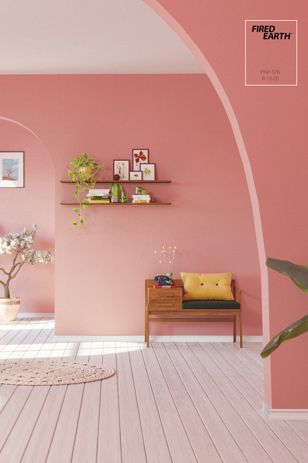
1. Pink is for girls
A soft pink is cool in almost any room – with the right hue, it can cast a glow that makes everyone in it look healthy and vibrant. Pink should always be anchored or offset with something masculine such as iron, bronze or aluminium along with deep-toned upholstery to really bring out its full colour potential, and it’s ideal for rooms like libraries, living rooms and even bedrooms.
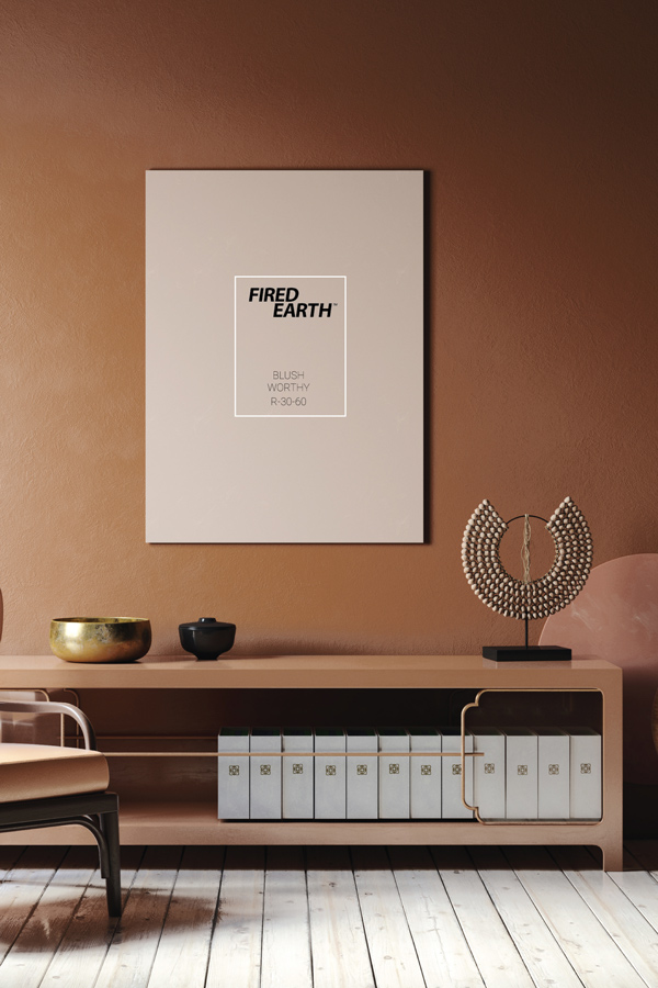
2. Brown is for boys
You may be concerned that brown is too masculine to use just anywhere. Nothing could be further from the truth. Pair it with pale warm colours or heat it up with bright pink, rich red or even lavender. If you want to bring balance to the space, you can do so by matching your browns with white for a clean, but boldly understated look.
3. Never use one colour for everything
Tradition dictates that door frames, skirting boards and mouldings should be one colour, usually white. You can say goodbye to tradition by introducing a bold accent colour into a space using the trims. This is great if you’ve got a fun arty space that you want to look unconventional. Another way to defy the norm is to go for a monochrome look. To achieve this, simply make your trims and mouldings a shade darker. The contrast might be subtle, but it will make a dynamic change in any room. Dark wood trim against light wood floors and pale walls with clean white interleading doors is another way you can really make your trims and mouldings own their real estate.
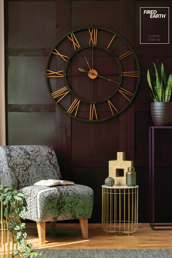
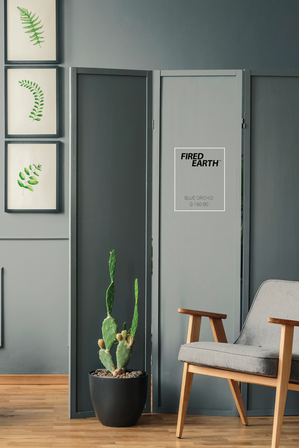
4. Stay away from black
Breaking this rule is like bunking class for the first time. It can be liberating and dangerous all at once. Black is the new white for trims, so don’t be shy. Using black as a contrast colour in a neutral room will create clean lines and a crisp classic look, no matter what style home décor you have, plus it’s a great way to define niche areas.
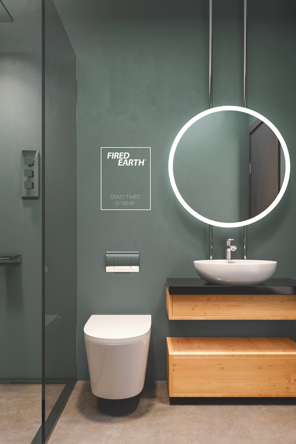
5. Bathrooms should be light
Most people paint their bathrooms white or a light colour. After all, it’s important for a bathroom to feel fresh and clean. But bathrooms are filled with reflective materials that, simply by having the light reflecting off surfaces, will help to illuminate the space. This presents a great opportunity for you to vary and expand your colour palette. Midnight blue or dark charcoal grey can transform a bathroom into a beautiful oasis of calm, so there’s no need to live in fear of the dark.
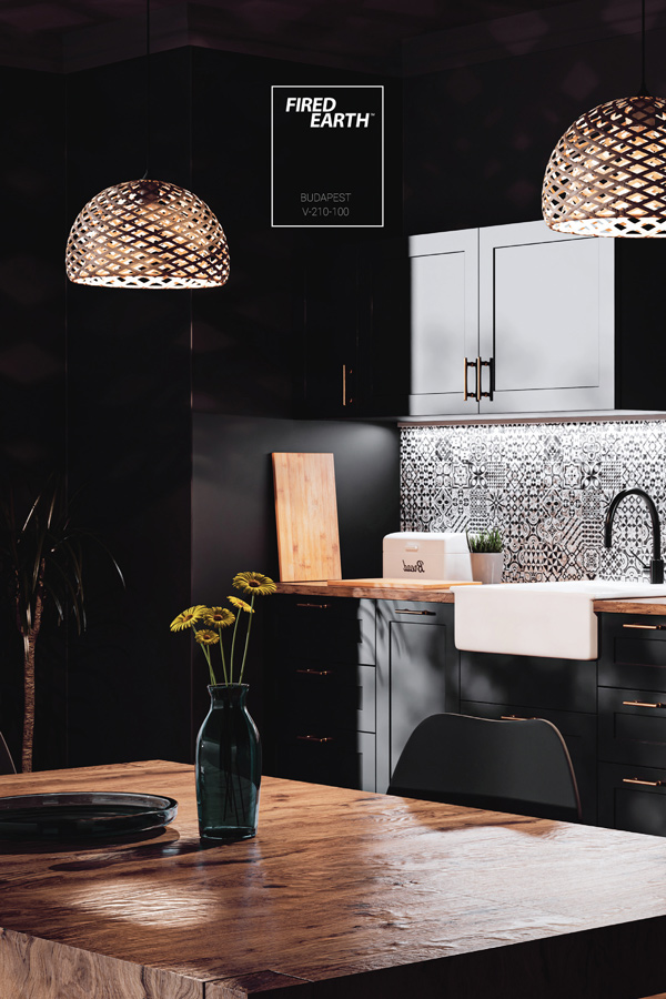
6. Dark colours are too difficult
Deep colours create moods. They can be soothing, evocative, romantic and grounding. While we may be comfortable with painting a study a dark colour, we’re often afraid to express ourselves with darker colour options in more common living areas like the dining room. Break the mould and break the rules, because dark colours can also be great for rescuing rooms (like kitchens) from the gloom of dull lighting. Plus, rich, deep colours draw the eyes away from mundane materials in a room, helping them to recede and not detract from the overall area./p>
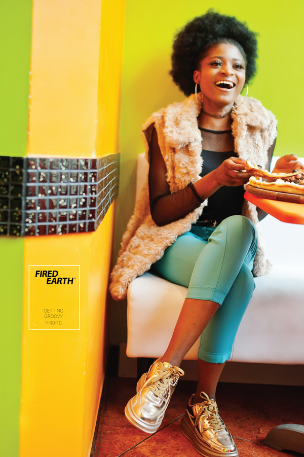
7. Who says colour can’t travel
If you get inspired by a colour on your local or international travels, don’t be afraid to tailor it to your setting. Remember, you don’t have to commit the whole room to the colour, you can hint at it with softer patches of the colour on an accent wall. Then introduce hues of the colour by adding artworks in that palette, or cushions and throws for example. It’s all up to you and how far you want your imagination to take you.
8. Old houses get historic colours
The truth is that many old houses e.g. colonial or Victorian could feel dreamy, drab, dark or oppressive with historically accurate palettes. The truth is, an old house is the perfect canvas for a more modern colour palette. What colours you settle on are up to you, so feel free to follow your impulses. Mix historic colours with more lively hues to update the whole house or just a room in it.
9. Art belongs on white walls
We fear that an intense colour on a wall behind a piece of art will be too decorative and detract from the artwork. In fact, the opposite often holds true, and an intense colour can help to focus attention on the artwork – especially when paired with task lighting. For seamless integration of your art with your wall colours, it helps to pick your background colour from the artwork’s colour palette.
10. When in doubt play it safe
If there was ever a rule to break, it’s this one. If you are new to taking risks with colour, spend time looking at books and magazines for pictures
of similarly sized and decorated rooms. To get comfortable with the notion of rule-breaking start by expressing your rebellious colour streak in one of the smaller rooms in your house and then take it from there.
Browse 1000’s of products available to you.
Select your country to Shop Online.


