So you want to paint, but there are more colours than sweets in a candy store. Follow these pointers to gain the confidence to choose.
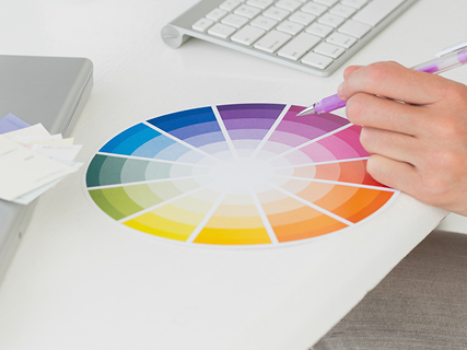
The colour wheel in a nutshell
The colour wheel is simply a guide as to what colours work together, and which are warm or cool. It can be intimidating, but remember, it is not there for choosing a specific colour. Its 12 hues are the purest and brightest colours and by no means your only options. The science behind the wheel can be narrowed down to the two basic schemes below.
Related colour scheme: This can be either monochromatic, combining different intensities of the same colour; or analogous, playing around with harmonising colours that sit next to each other on the colour wheel.
Contrasting colour scheme: Pair dynamic complementary colours from opposite sides of the wheel, such as cool blues and warm yellows.
Where to start
- Trust your instincts. Your favourite colours, and preferences for either brights or pastels, are good starting points. Make a mood board of interiors that appeal to you, and see which colours pop up most frequently. Are they neutral, bright, warm or cool? A related or a contrasting scheme?
- Next consider the mood. Do you want a tranquil, dramatic or energetic atmosphere?
- Before tackling an entire wall or room, paint sample boards to place in different areas – next to a window and in darker spots. This enables you to judge the full effect of light on your paint choices, and how the colours will coordinate with your decor.
How colour can change the mood of a room
- Vibrant hues create an uplifting, lively look.
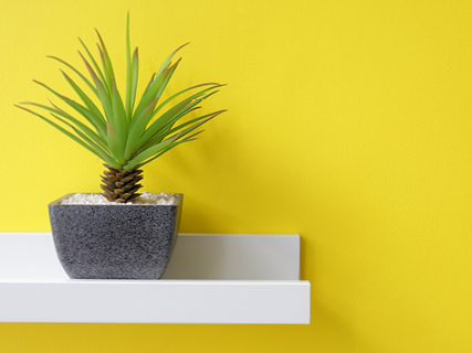
- White, cool blues and crisp greens will make a hot, sunny room appear cooler and create a tranquil ambience.
- Red, even in small doses, adds punch.
- Small space? Paint a dark focal wall. This will make the wall recede, making it seem further away and, bingo, the room looks much bigger. White or a light shade will reflect light from the rest of the walls, which will lend a light and airy feel.
Paint colour choosing dos and don’ts
Do:
- Choose paint colours in natural daylight to see the true colour.
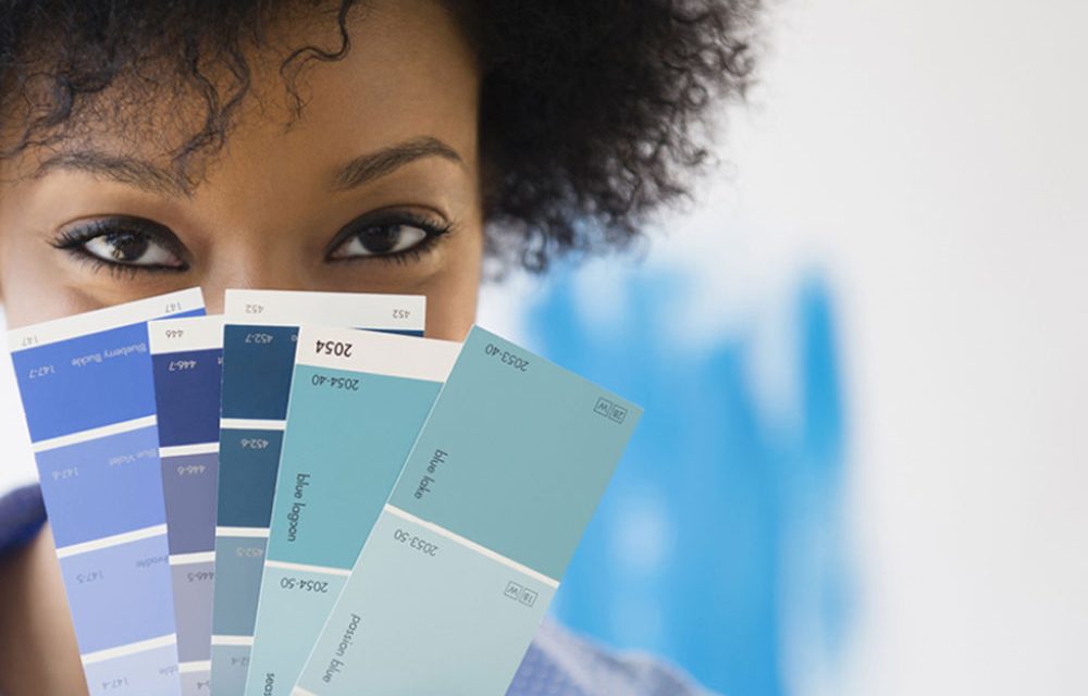
- Look at paint manufacturers’ paper strips on a white surface. If you’re confused about the undertone of a light colour, look at the two darkest colours on the strip. This will tell you whether that light grey has a violet or a blue undertone.
- Create a harmonious, balanced interior by repeating accents throughout your home.
Don’t:
- Go too matchy-matchy. It might seem like an easy solution to match your paint to the curtains, but this is too much. Choose a more or less intense version of the same colour, or be bold and choose a complementary colour!
- Decorate without contrast. If you have fallen in love with the new neutrals – charcoal and soft greys – a contrasting white or yellow will add interest to your scheme. This could be on architectural details such as a mantelpiece or in the form of a large artwork.
- Play it too safe. If you always wanted an intense blue focal wall, don’t choose a neutral just because you think it will be more practical. Remember, it’s just paint – the easiest thing to change in any interior.
- Copy your friends. Your home should be an honest reflection of your personality, not theirs.
Browse 1000’s of products available to you. Select your country to Shop Online.


