Are you renting a home that you’re keen to decorate? An inventive couple shows you how to do it, without breaking the bank.
Grouping
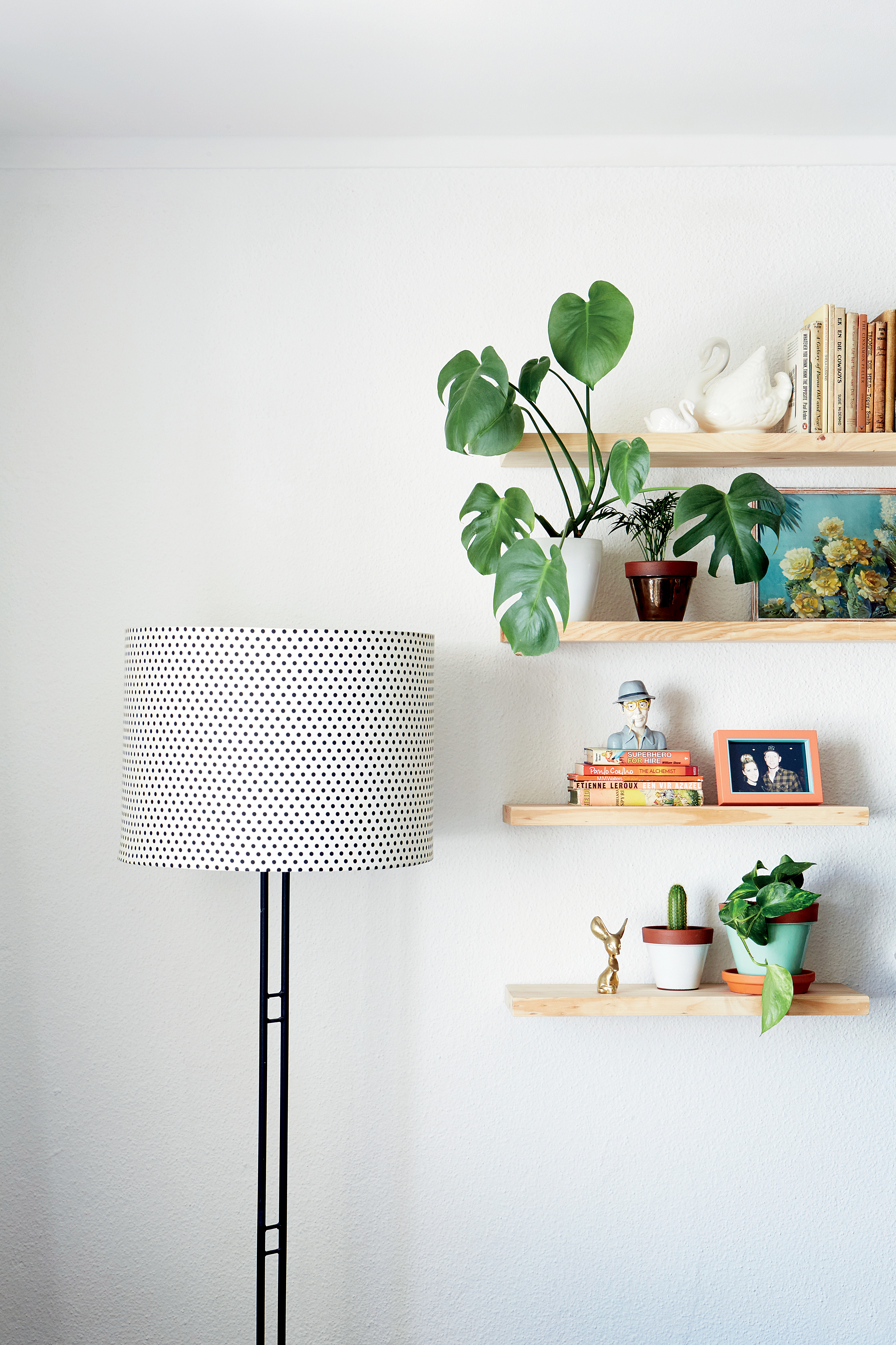
Prevent open shelving from becoming untidy by arranging elements in groups of three or five, leaving breathing space in-between! Keep your arrangement forever fresh by incorporating plants.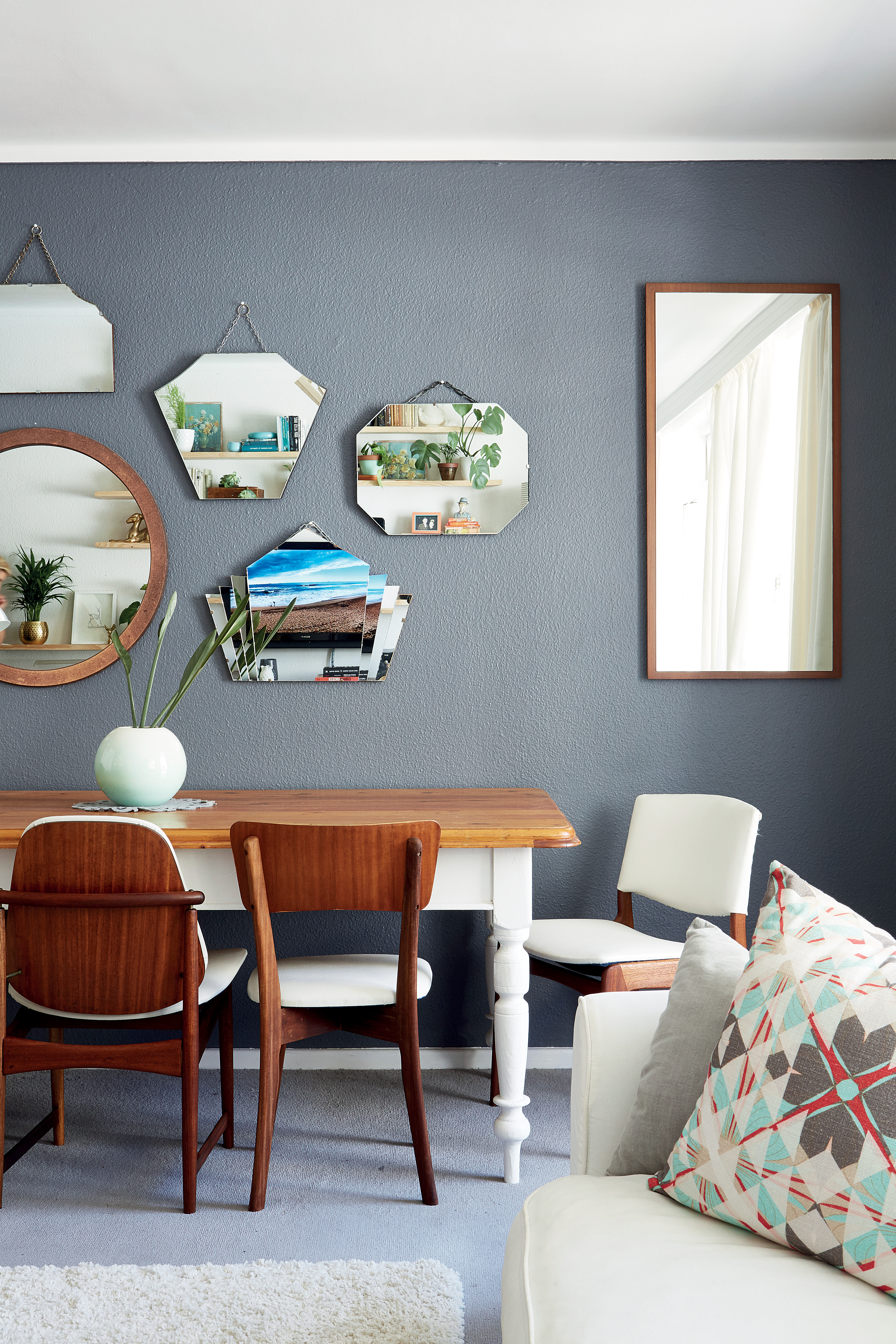
Table placement
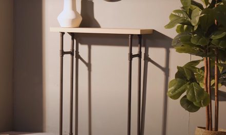
Because the living room also serves as a dining room, a narrow table positioned right against the wall is ideal. The table, a gift from Annie’s parents, is made from recycled Oregon pine ceiling boards. She painted the legs white to lighten the look in this small space. When they have visitors, they move the table away from the wall and put chairs around it. Annie also uses the table as a desk; her laptop and study materials are stored in a cupboard alongside it.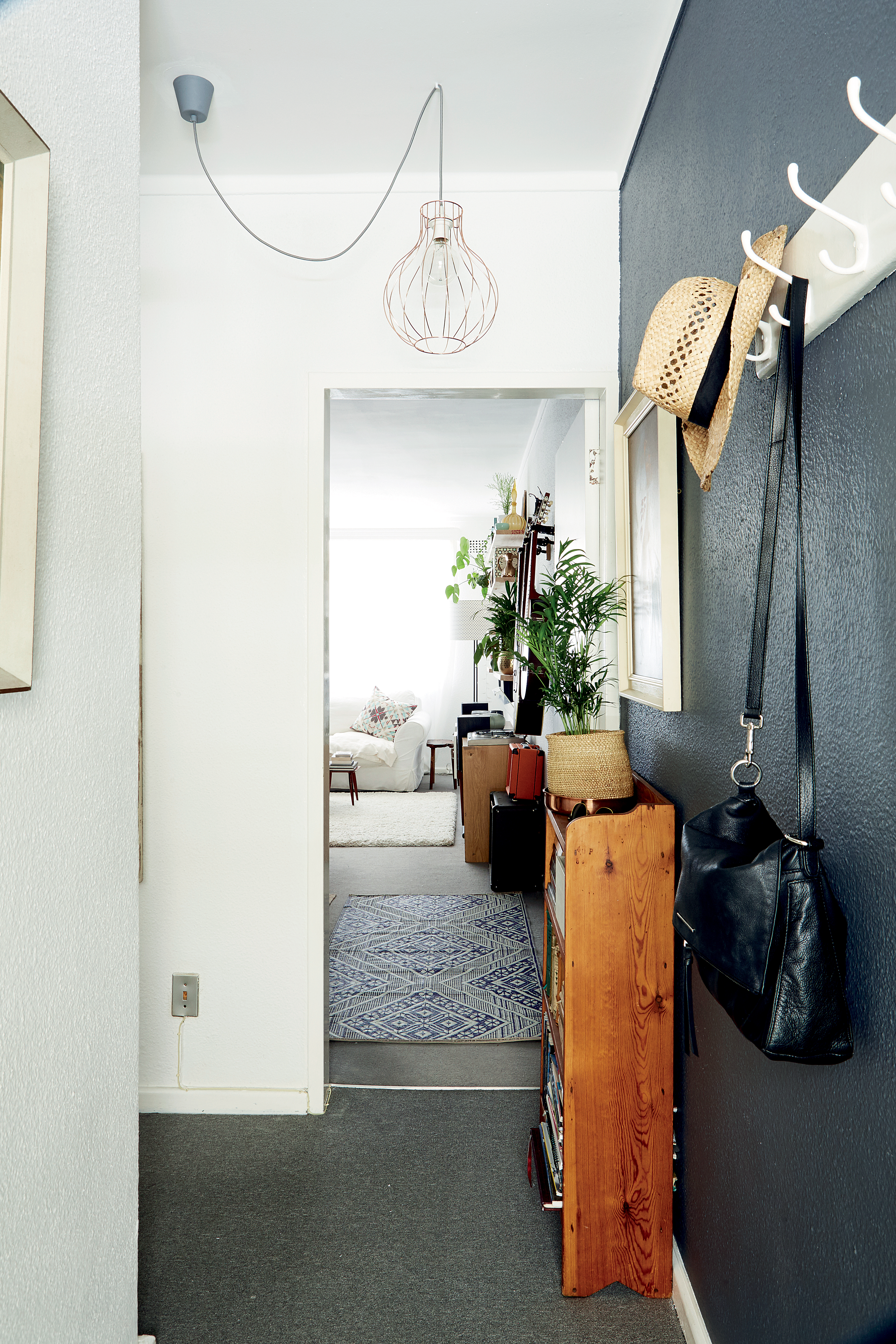
The entrance
Put your personal stamp on your home right at the entrance, says Annie. “Paint an accent wall and replace an unsightly ceiling light. It’s something you can spend a few rands on, seeing as you’ll be able to take it with you when you move. Just make sure you store the owner’s lamps somewhere safe and put them back when you relocate!” The old freestanding bookcase from Annie’s childhood bedroom provides extra storage space for books and magazines. On the second shelf, Annie has placed a wooden crate in which items such as sunglasses, memory sticks and other clutter can be kept neatly stored and close at hand. Artwork bought at pawn shops decorates the once empty walls. Just a bare bulb hanging from the ceiling provided light in the entrance hall, but now a grey cord (about R50 from Builders) and bronze-coloured shade have transformed it into a focal point. The walls and ceiling were given a fresh coat of white paint, while the accent wall was painted in Plascon’s Charcoal. “The coat rack was rescued from our previous home.
The living area
Although the apartment isn’t very spacious, Annie painted a focal wall in the same grey as the entrance hall. “There was more than enough paint left over, so nothing was wasted. In addition, it creates cohesion between the entrance hall and living area,” she explains. First get permission from the owner, Annie advises, and undertake to repaint it when you move out. Then you shouldn’t have any problems. “And don’t be afraid of a dark wall in a small space – it adds depth, especially when there’s enough natural light, like in this room which leads out to a sunny balcony.” The collection of vintage mirrors adds to the sense of space and reflects the detail on the floating shelves which Jaco put up on the wall opposite the focal wall.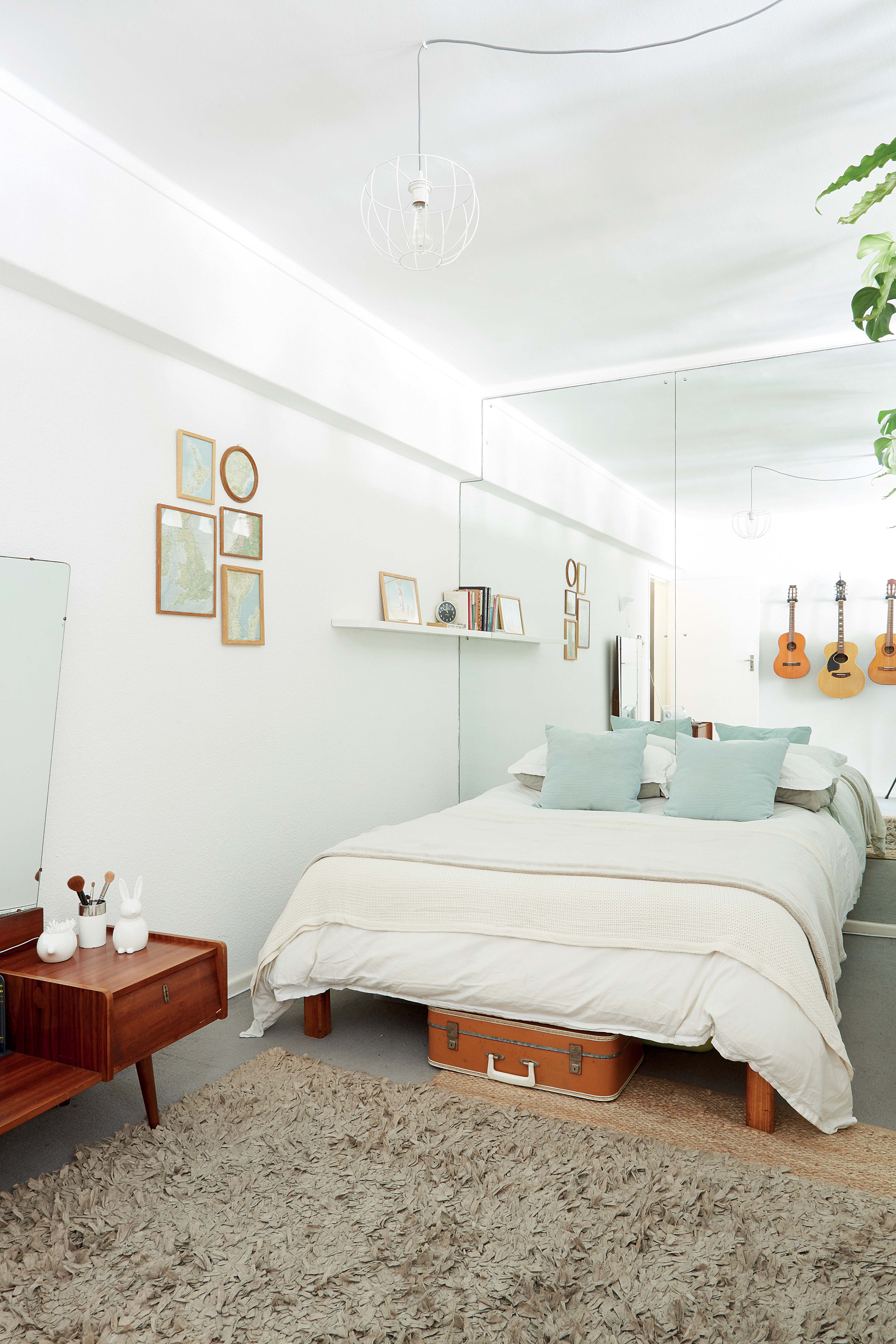
The bedroom
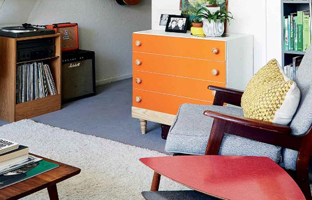
The freestanding cupboards that separate the bedroom from the living area were already in the apartment and can be moved at will. They were in a rather bad condition, but Annie and Jaco rolled up their sleeves and, with the owner’s permission, sanded the wood and gave them a fresh coat of white paint; they also replaced the old doorknobs. Because there are no windows in the bedroom area, they placed potted plants on top of the cupboards – this allows in enough light from the living area and makes it feel like you’re ‘outdoors’. “And it prevents the top of the cupboards from becoming an unsightly storage area!” says Annie. The mirrors behind the bed were already there when they moved in. They make the room seem bigger and reflect the available light.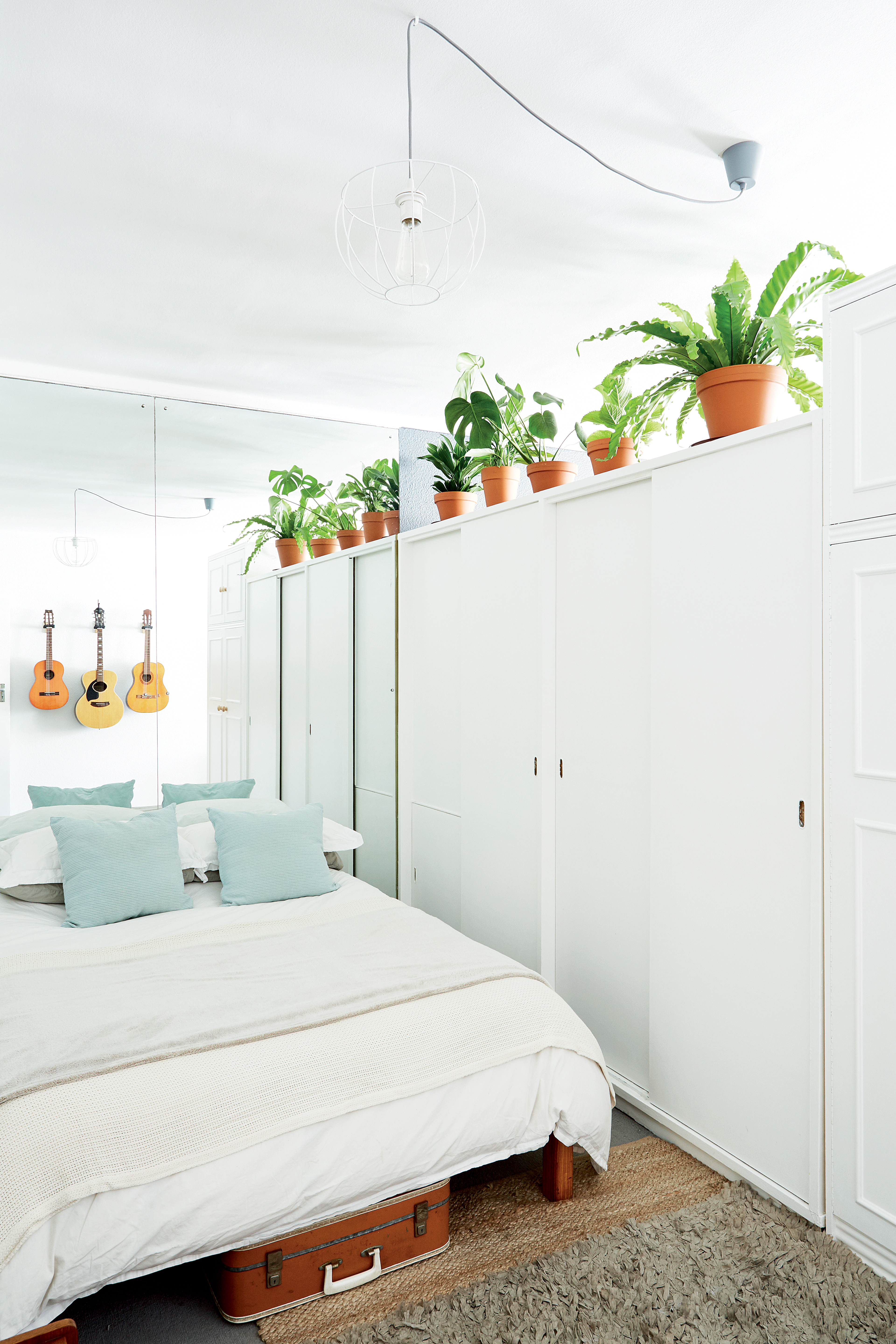
Vintage
The vintage suitcase underneath the bed belonged to Annie’s grandfather; it provides storage space for her scarves, gloves and handbags. The wire lampshade is the framework of an old lamp.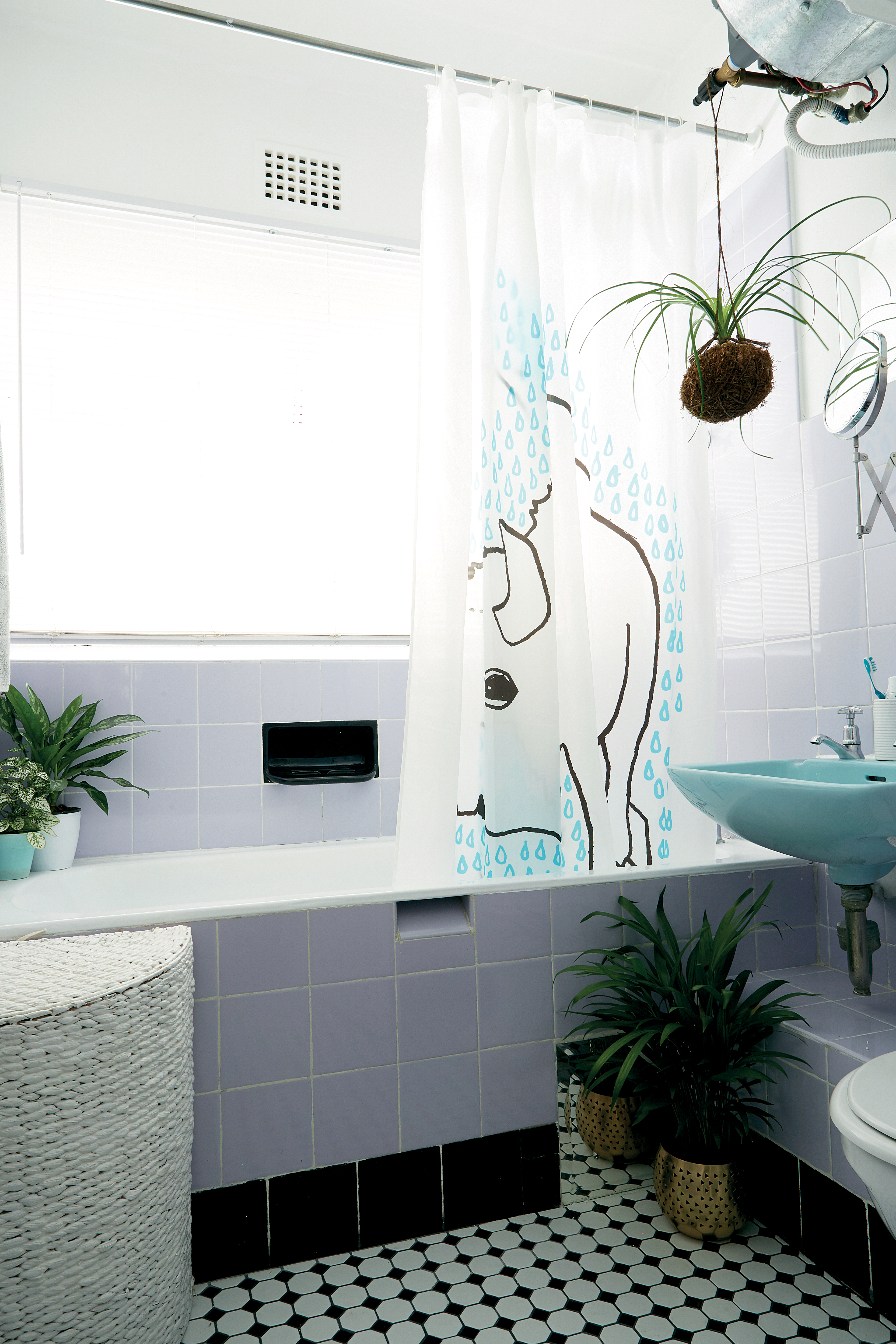
Bathroom
An advantage of a small space is that you can re-tile the floor fairly cheaply. “The owner of the apartment was only too happy that we were prepared to replace the old, broken vinyl tiles and paid for the new ones. Here, black and white mosaic tiles have restored the 1950s bathroom to its former glory. They come in 30 x 30cm sheets. The old steel window frames and burglar bars received a coat of white paint, and affordable plastic blinds. The blinds create a clean, well-rounded look and are a practical solution, especially since the showerhead is situated above the bath. A striking shower curtain (this one from Ikea was a gift from overseas) brightens up the bathroom and with a fresh lick of white paint on the walls and ceiling, the room once again looks bright and airy. “We didn’t paint any tiles,” says Annie. “We liked the original 50s colours in the bathroom – lilac and light-blue. They just needed a thorough cleaning and new grout.”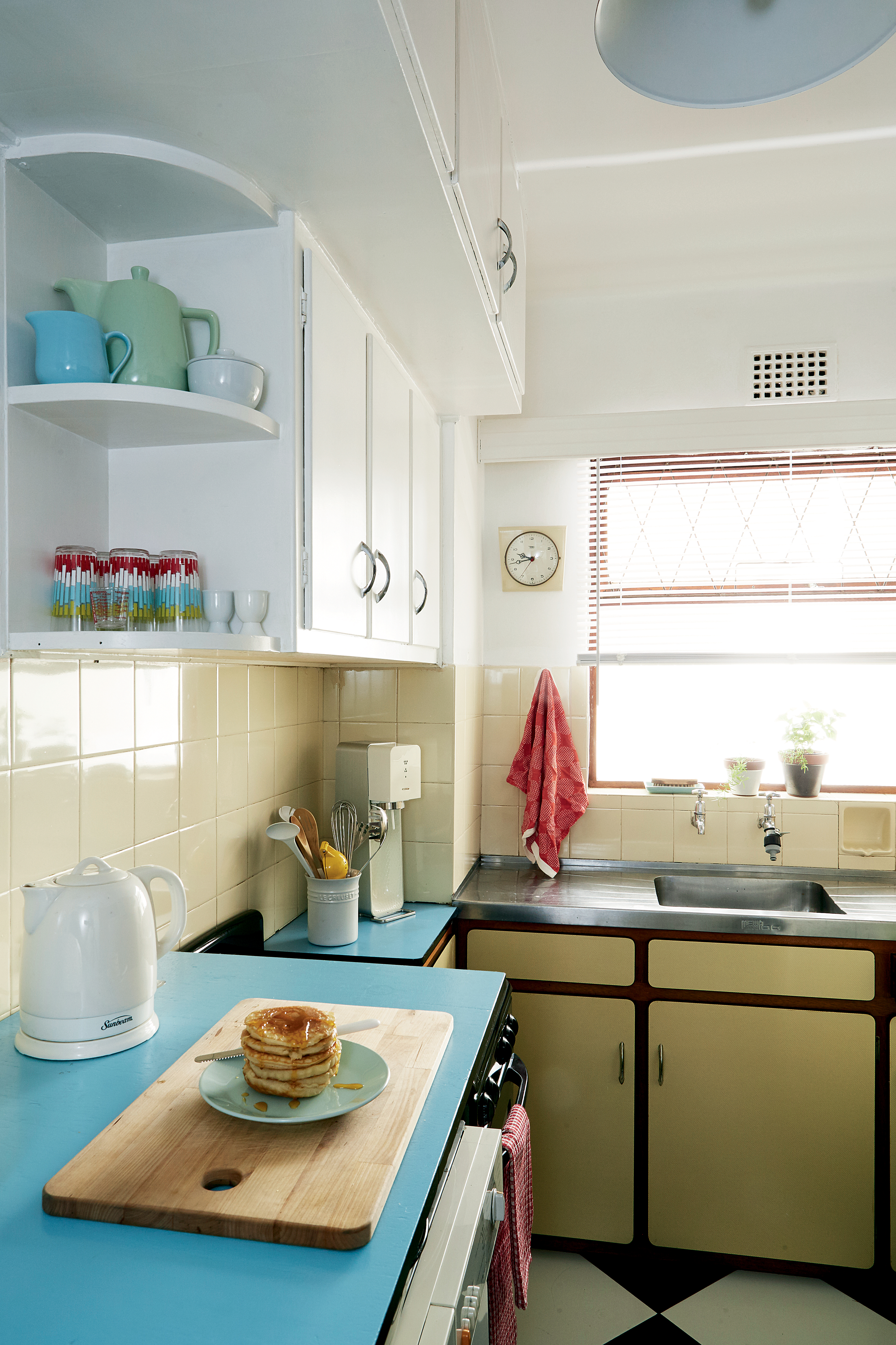
The kitchen
“Our inspiration for the kitchen renovation was 1950s diners – our priority was to utilise the limited space as best as possible,” says Annie. “When we moved in, the only work surface was a tiny piece of blue formica in the corner next to the stove. There was also a small built-in breakfast nook, but the table was full of burn marks and the plywood was crumbling.” Jaco made a new table for the breakfast nook with timber and L-brackets, as well as a handy extra work surface high enough to accommodate the washing machine and tumble-dryer underneath. They painted it with high gloss enamel in the same blue as the existing small countertop and glued a black plastic strip around the edge. The floor was covered in broken vinyl tiles. “We replaced them with black and white porcelain tiles,” says Annie. “We sanded the white cupboards and repainted them, and the walls also received a fresh coat of white paint. “A small three-plate stove also works better in this space than the massive old-fashioned stove that, in consultation with the owner, we donated to charity.”Credits
Referenced from Gallo images / Home Magazine

